Tagxedo
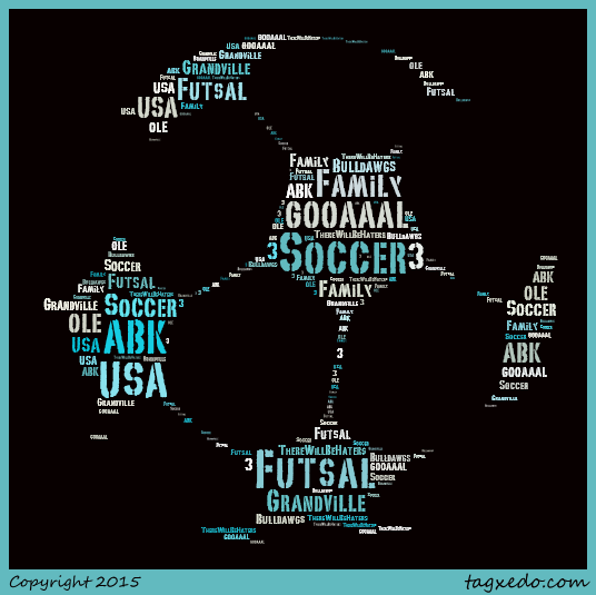
The purpose of this object was to select an image that best represents you, and to create words inside the object (mine is a soccer ball) that explain your interest. There was nothing difficult about this project. I would not change anything if given the opportunity to do so. What I enjoyed most about this project was thinking of the words that described me.
Sun and Clouds

The purpose of the assignment was to make a sun behind the clouds, and to make the clouds look like they are overlapping the sun. I had to place the sun behind the clouds. I learned how to draw with my pencil tool. The skills I implied in the picture was how to draw a cloud with my pencil tool, and than to erase the bottom half of the cloud with the eraser tool. The part that I found most difficult about the project was placing the sun behind the clouds and not in front of the clouds. If given the opportunity, I would use less triangles around the sun, so the final display of the sun would look like the one that you showed us. What I enjoyed most about this project was learning how to use important tools in the adobe illustrator.
Pen Tool Projects 1 and 2

|
|
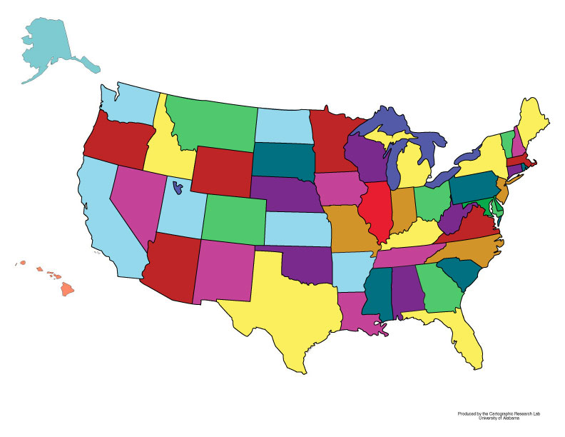
The purpose of the project was to outline the United States using the pen tool. I learned how to increase my pen tool skills in many ways. The most difficult part about this project was outlining the Delaware and Maryland area on the map. I given the opportunity, next time I would take my time instead of rushing because I wanted to make sure that I got this done and I would not fall behind in the class. What I enjoyed most would be outlining the great lakes because I live in Michigan.
The project on the left's purpose was to advance your pen toll skills in the process of retracing a person, an animal, and an object of your choice. The most difficult part about this project for me was getting every detail in my person. Next time, I wouldn't spend so much time on the person, so than I can spend more time on the object of my choice. What I enjoyed most about this project was increasing my pen toll skills. I am sure this project will help me in the future.
The project on the left's purpose was to advance your pen toll skills in the process of retracing a person, an animal, and an object of your choice. The most difficult part about this project for me was getting every detail in my person. Next time, I wouldn't spend so much time on the person, so than I can spend more time on the object of my choice. What I enjoyed most about this project was increasing my pen toll skills. I am sure this project will help me in the future.
Principle of design
|
|
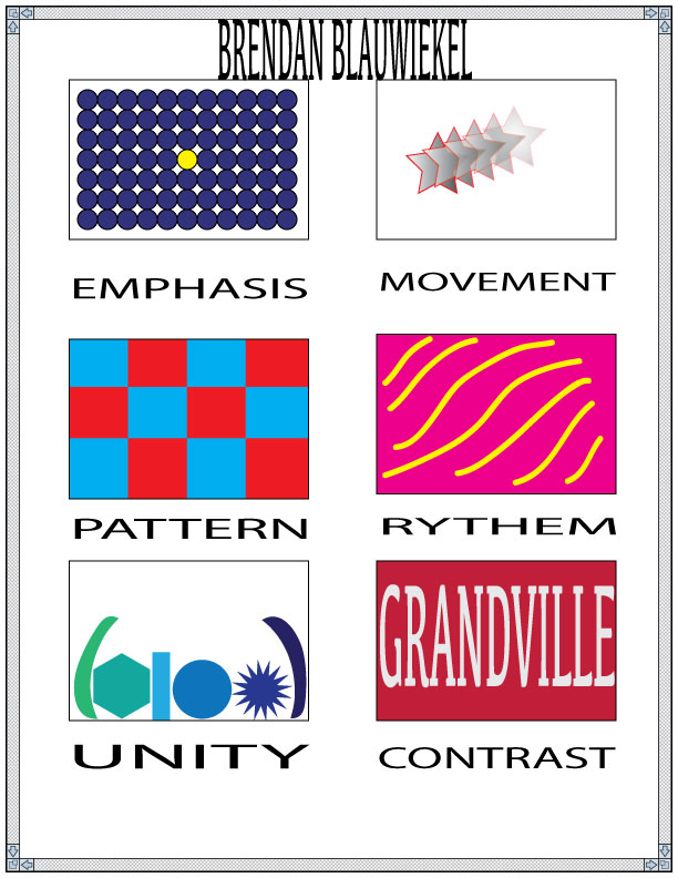
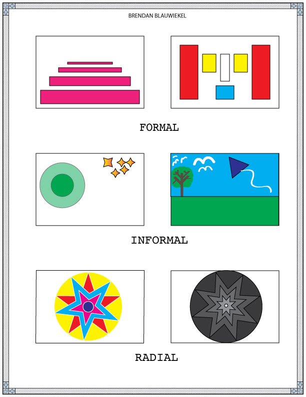
The first project of my document shows the three types of balance that can occur. Formal, informal and radial. The second project show emphasis, movement, contrast, pattern, rhythm, and unity. The purpose of this project was to create a picture using the types of balances I listed before. I learned how to illustrate the difference between the types of balances. The most difficult task about this project occurred in the informal area. I had to think very hard of what to illustrate in the two boxes. Next time, I would make a new contrast, because I think I could have challenged my self more. What I enjoyed most about this project was learning about the different types of balances.
Typeface 1, 2 and 3

|
|
|
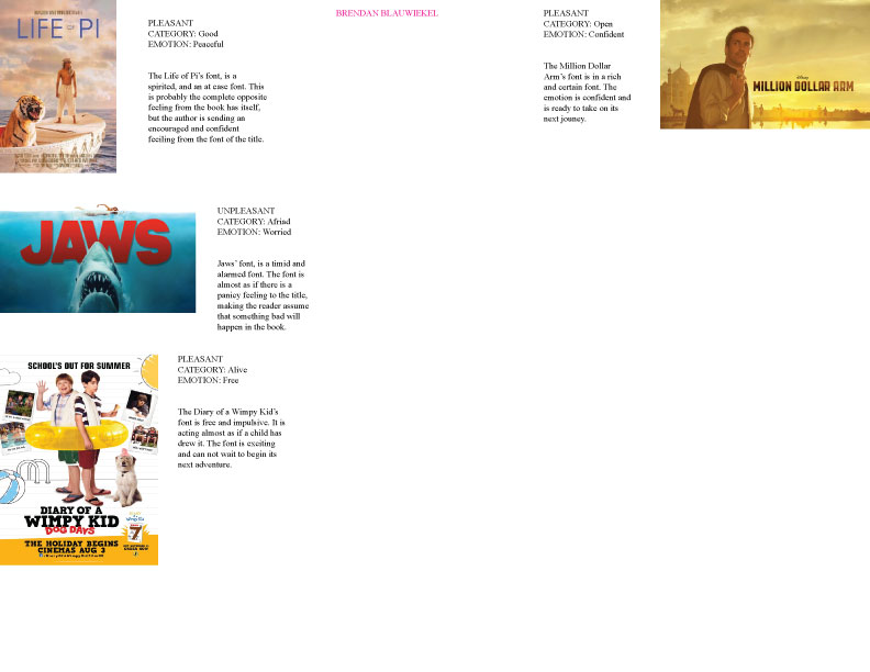
The purpose of the helvetica essay was to create a paper stating whether we should use or not use Helvetica in the future. The purpose of the word art project was to create one word, and to use only the word to describe it. For the web quest project, the purpose was to find a total of 4 book covers that show different emotions. Than, to show a picture of the cover, list the type of emotion that the typeface is evoking (as well as the emotion section and category), and write a short paragraph (3-5 sentences minimum) explaining why this is the correct type of emotion and how it affects the rest of the design. The most difficult part about the Helvetica essay was trying to find a good reason why not to use helvetica. There was no difficulty in the word art project. Everything went smoothly. The most difficult part about the web quest project was digging deep and try to feel what type of emotions the letters have on the book cover. If I were able to go back and redo these projects, I would have changed the amount of time I put into them. I was so nervous getting these in on time because I do not want to fall behind in his class. What I enjoyed most about these projects would be coming up with the emotions that the title of the books evoked. No two people would feel the exact same about the emotions on a book cover because everybody has different feeling inside of them. As you can see, this is what the purpose of these projects were, the most difficult part, what I would do different if given the chance and what I enjoyed most about these projects.
Alphabet Page
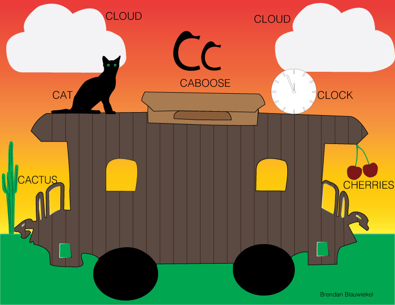
The purpose of this project was to create a one page landscape layout for a children's book, teaching about the letter and words starting with that letter that was assigned to you, and to think of creative ways to teach the letter, including a creative layout with a background environment without any floating objects. First, since I was assigned the letter C, I had to think of some nouns that started with this letter. Second, I had to draw this noun onto my landscape paper and make it interesting enough for a child to read. In this project, I displayed my pentool skills. The most difficult part of this project was to find my center of attention, and in the end I ended up coming up with the caboose. Next time, I would draw a grandfather clock to display my pentool skills. I enjoyed drawing the caboose the most in this project.
